MyRez
Mobile app for cohabitants (families or housemates) to coordinate their schedules and tasks in their daily living circumstances.

For this Capstone Project for my Interaction Design Specialization Certificate program on Coursera, I created a prototype of a proposed mobile app that helps college students and young adults living in the same household to communicate with each other and coordinate their schedules easily.
Over the course of 10 weeks, I successfully carried out the full UX design cycle by discovering user needs, gathering user feedback with low-fi and high-fi prototypes, and building and delivering the final mobile app design.
Project Timeline: March — May, 2017
Tasks & Responsibilities: Research user needs, ideate solutions, create storyboards, develop mockups and wireframes, create high-fidelity prototypes, test usability of prototypes, and deliver final app design
Platforms: Mobile App (proposed)
UX Methods Used: Exploratory interview, paper prototype testing, heuristic evaluation, in-person prototype usability testing, and remote A/B testing
UX Tools Used: Balsamiq Mockups, Marvel app, Sketch, InVision, UserTesting.com
Final Prototype: https://invis.io/MDBEQKHU6 (Interactive Mockup)
Promotion Video: https://www.youtube.com/watch?v=IfxJOEMDhNE
Want to know more about how I carried out each step of the design process? Read below.1. Need-finding & Ideation
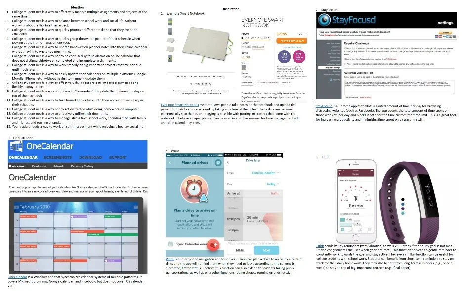
I kicked off the project by conducting exploratory interviews to identify user needs that would serve as design inspirations. As a starting point, I chose to delve into the topic of time management for college students and young adults. I interviewed 3 participants to learn what tools and strategies they are currently using to handle multiple tasks, not just the ones related to school assignments or work, but also the demands related to family, social life, and other errands.
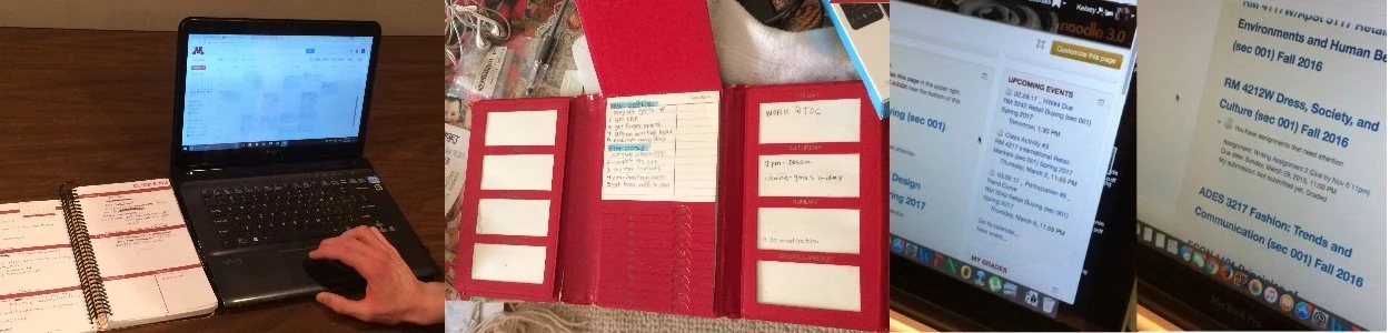
Following the interviews, I brainstormed opportunities for design that would address the needs of the user population, and also created an Inspiration Board with several existing designs that could inform the design decisions, describing the insights and lessons I’ve drawn from each product.
The last piece of inspiration came from the Capstone Project course initiative to share and improve upon other students’ design briefs, where I was inspired by a design brief calling for a solution to facilitate shared living experiences through seamless communication and collaboration.
Seeing a great opportunity to combine these insights and inspirations, I wrapped up this discovery phase by formulating my final Design Point of View:
“With easier collaboration and coordination among roommates/housemates, much of the hassle in everyday life of the college students and young adults could be reduced, thereby saving time for these users.”
2. Storyboarding and Wireframe Building
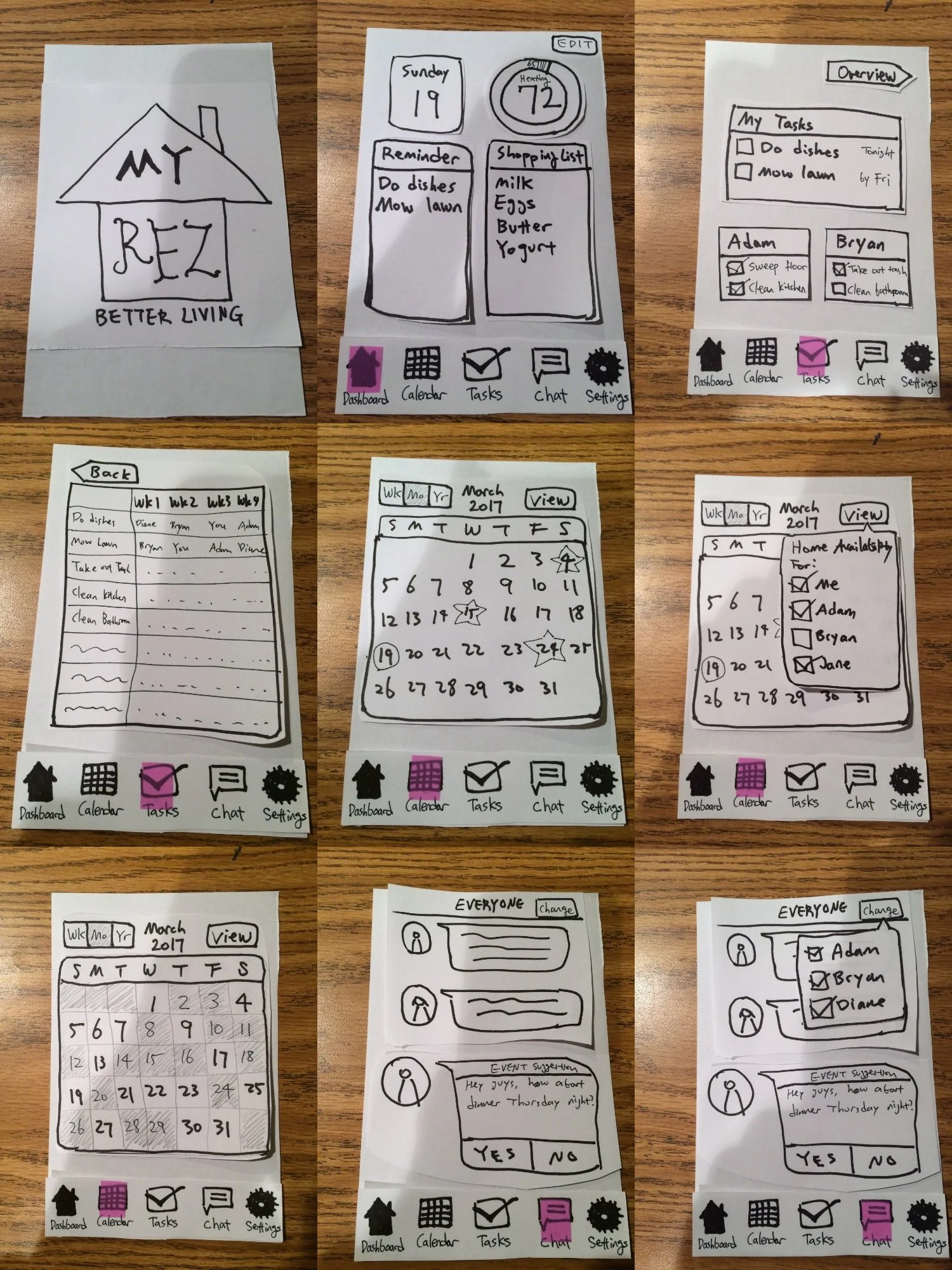
I then came up with two different design ideas that address the user needs of young adults living in the same household, and created a storyboard for each of these ideas.


Afterwards, reflecting on the storyboards and how the design idea addresses the user need, I created hand-drawn paper prototypes for rapid visualization.
3. Wireframe Testing & Heuristic Evaluation
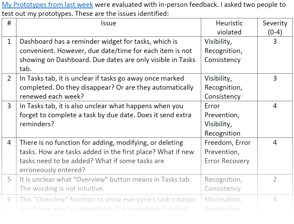
To identify any usability issues in the proposed design, I conducted a rapid UX study with a couple of participants, who were asked to treat the paper mockups as real apps and ‘think aloud’ as they navigated this interface. I then reviewed and noted down all the participant responses or reactions that would suggest any violations of Nielsen’s 10 Usability Heuristics. Each usability issue was also rated from 0 (minor violation) to 4 (major violation).
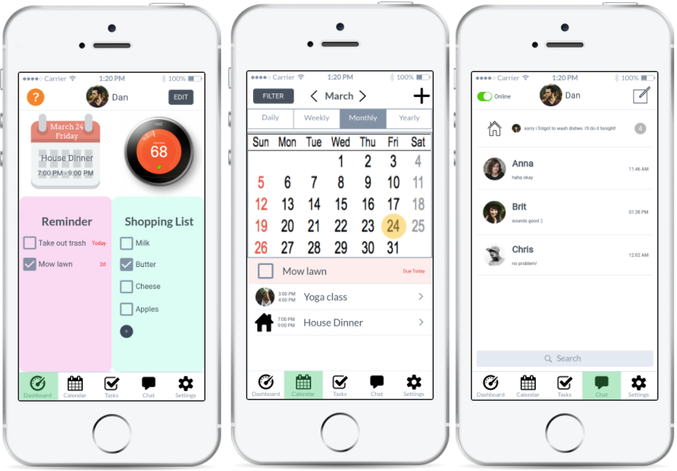
I summarized these findings to one paragraph, digesting the major issues identified from the Heuristic Evaluation, and hypothesized potential solutions to them. With this information in mind, I began creating my first low-fidelity digital wireframe of my mobile app, using Balsamiq Mockups.

4. Development Planning & Prototype Building
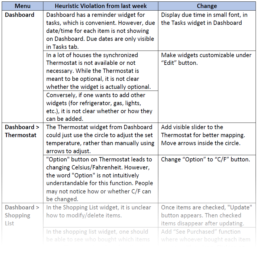
To start making a detailed development plan, I reviewed the Heuristic Evaluations list and delineated my design decisions to address each of the violations.

For 2 weeks, I created mockup screens to build a test-ready interactive prototype. (I used Marvel App initially and switched to Sketch and InVision to build a more sophisticated functioning prototype for user testing.)
Next, I created a development plan, using a spreadsheet template to divide up and organize the tasks for the upcoming weeks to develop an interactive prototype and run usability studies. I laid out basic/stretch goals for each week and continually updated the spreadsheet to keep track of the progress for the remainder of the project.
5. Prototype Usability Testing (in-person)
After drafting the testing protocol for consistent preparation and execution of the study, I conducted an in-person prototype usability testing with 2 participants, using a mobile phone for a realistic simulation. I explained the goal of the study and the purpose of the app, and asked the participants to complete a series of tasks. The participants overall completed the tasks well, but a couple of design issues were identified.

Issue 1: Instead of clicking on the “Mow lawn” cell button, the participant swiped the button left. (InVision registered it as the ‘next screen’ command and went to an unrelated screen.)
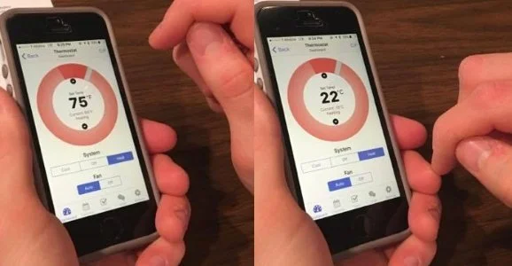
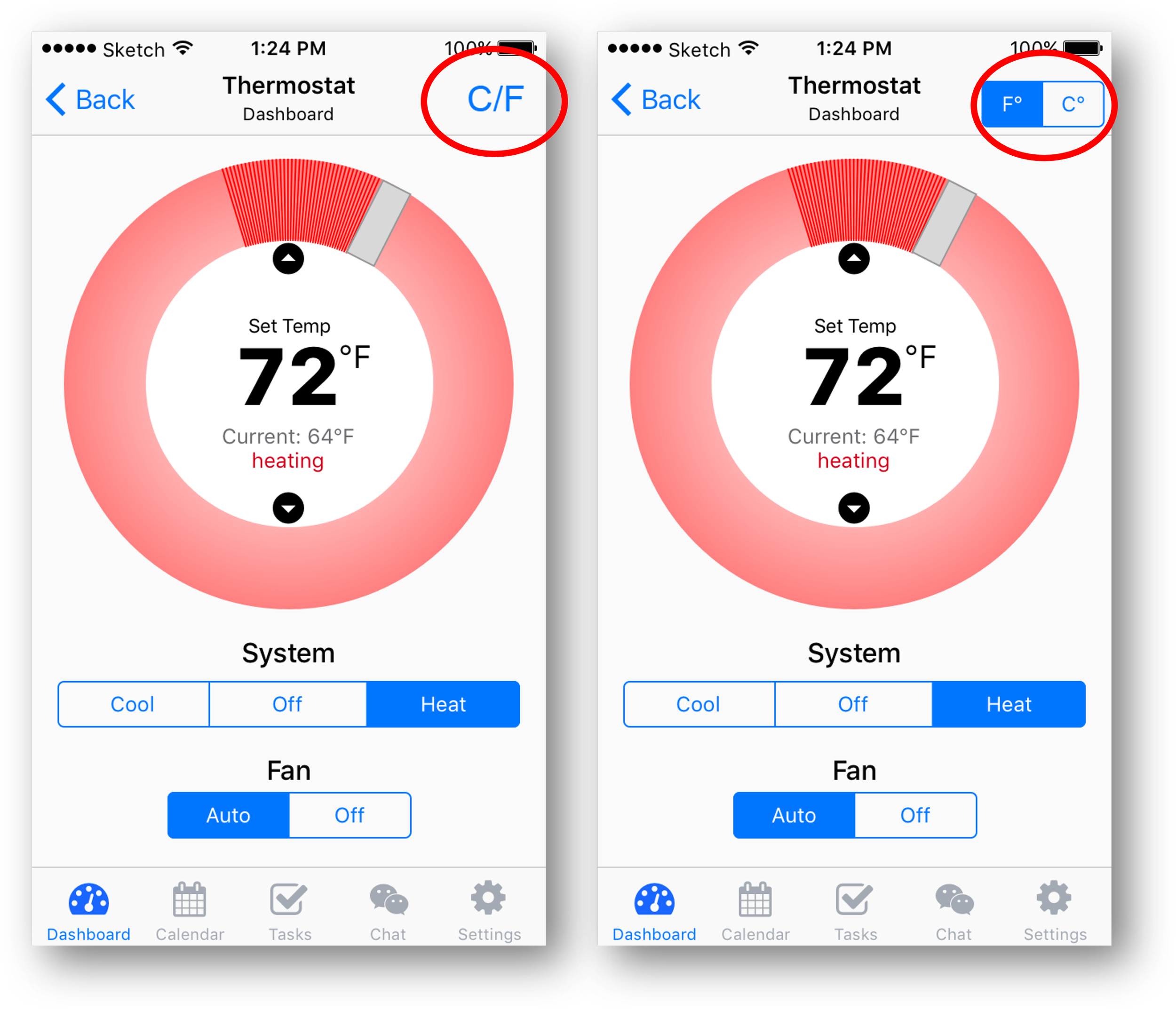
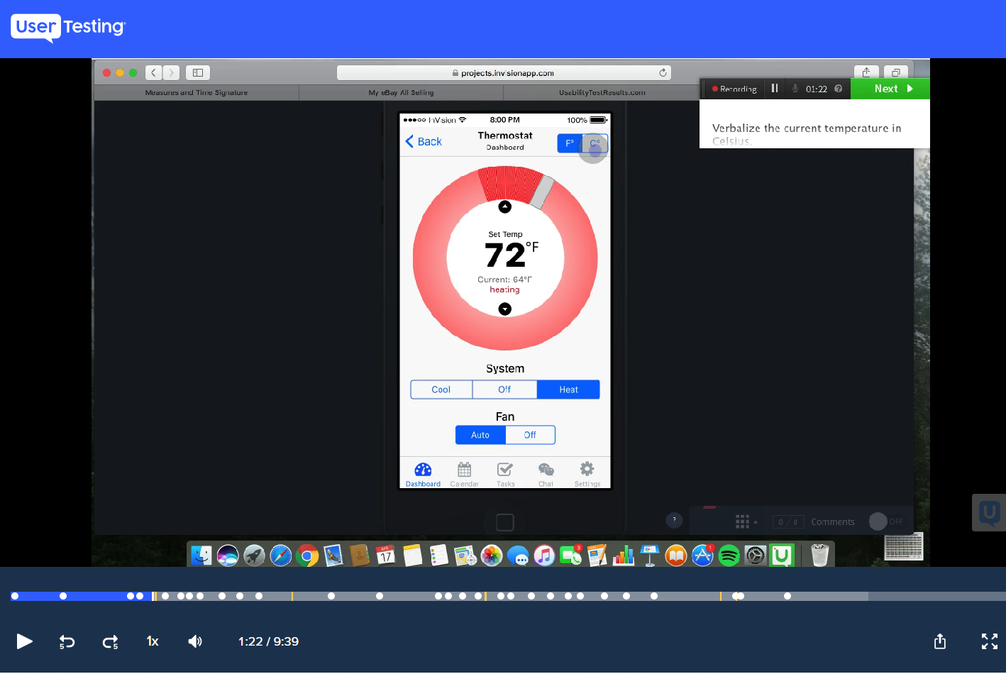
Issue 2: He couldn’t easily find the “C/F” button on the top right and changed the set temperature accidentally. Even after identifying the right button, he struggled to click because it was so small for his fingers.
Quick UI design adjustments were made to address these issues, and the subsequent iteration formed the basis of A/B testing that followed.
6. A/B Testing (remote)
To evaluate the effectiveness of alternative design components against those from the initial prototype, I carried out a remote A/B testing via UserTesting.com. In this unmoderated usability study, participants followed a series of prompts to navigate the randomly-assigned prototype (either A or B), while recording their screens and verbal responses (using the ‘think-aloud’ method). Each prototype was tested by 2 participants (4 total).

Overall the testing revealed that any differences between participants’ reactions to the prototypes A and B were minor, since all participants were able to accomplish all assigned tasks.
The segmented switch for F°/C° appeared to have worked slightly better, and hence was chosen for the final design, as the participants in the B condition had shorter response times.
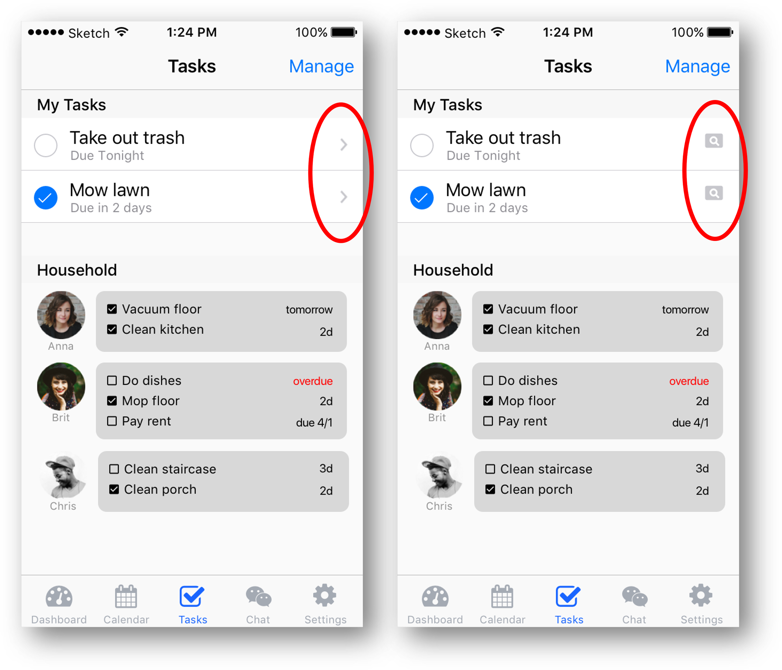
Otherwise, the difference between seeing ‘right arrow’ icon or the ‘view’ icon on the cell buttons did not matter. I decided to go with the standard cell button design (with the “>”), for more consistency for those who are familiar with iOS.
However, the online testing also revealed a novel issue that had not been apparent in the previous in-person testing.
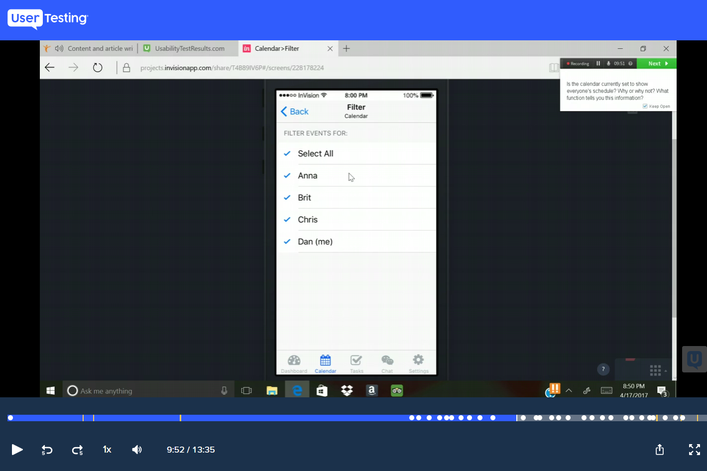
All participants made comments on the calendar UI being confusing, and none of the participants grasped ‘today’, ‘task(s)’, ‘event(s)’, and ‘selected date’ legends exactly as intended. Even the “Filter” function took participants a while to figure out. There is a need to make the calendar UI simple and intuitive. This feedback proved to be useful in making plans for final design revisions.
Nevertheless, all participants rated these prototypes as either 4 or 5 (out of 5) on the intuitiveness scale. They all commented that except for the calendar UI, other functions and features were easy and intuitive.
7. Show and Tell
Informed by the A/B test results, I constructed the final version of MyRez app prototype. (Try it on a new window)
I also created a quick promotion video introducing the app:
In conclusion…
What I learned
I learned many software skills, including Balsamiq Mockups, Marvel App, Sketch, and Invision.
I learned how to run the full UX design process from interviewing participants to identify potential needs and ideating solutions to address the needs of the user population, to testing these proposed designs through many iterations and building the final design based on usability heuristics and user feedback.
I learned how to combine and balance the identified user needs with another design directive shared in the Capstone course, showing flexibility and adaptability in executing the design process and project objectives.
Any surprising insights from user research
It was interesting that the in-person testing and online revealed different insights about the design. The in-person participants had minor issues with a couple of icons, whereas the online participants instead were confused about the calendar UI. I am glad that I was able to catch these issues with different testing methods, and I learned the benefit of going through multiple iterations and testing methods throughout the design process.
Most challenging thing about this project and how I overcame it
I had some challenges finding the right UI design tools to use. I tried using Balsamiq Mockups and Marvel App, but I found their functions were limited and difficult for creating a polished prototype. Luckily I was able to get a trial version of Sketch for 30 days, during which time I was able to overcome the initial learning curve of the program and successfully complete the project.